Dental Clinic Web Design Ideas
In today's digital world, your website is often the first impression potential patients have of your dental clinic. Before booking an appointment, most people search online to compare clinics, ser
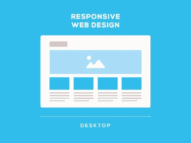
Continue ReadingEnhance your online presence with top-tier Responsive Web Design in Coimbatore, India. Our expert team crafts user-friendly, mobile-optimized websites that deliver seamless experiences across all devices. With a focus on performance, aesthetics, and functionality, we ensure your website adapts perfectly to any screen size. Whether for businesses, startups, or eCommerce, our custom solutions improve engagement and drive conversions. Experience the perfect blend of creativity and technology with Blazingcoders, your trusted partner in web excellence. Stay ahead in the digital landscape with a responsive, high-performance website that meets modern standards.


Custom Conversion from PSD to HTML: Use our accurate PSD-to-HTML services to turn your imaginative designs into faultless, adaptable websites. High-performance websites for all screen sizes are produced thanks to our meticulous attention to detail, which guarantees pixel-perfect correctness and device adaptation.
Quick Conversions: We promise 30% quicker turnaround times thanks to our well-oiled systems and talented developers, enabling you to launch your website more rapidly without sacrificing quality.
Unlimited Flexibility: You can fully modify our designs to suit your business requirements. According to recent usability research, this flexibility helps organizations enhance user happiness by 60%.
Modern Technology: We make sure your website stays ahead of the competition and complies with current web standards by utilizing state-of-the-art tools like HTML5, CSS3, and JavaScript frameworks.
24/7 Availability: To ensure smooth project delivery and continuous maintenance, our support staff is available to answer your questions at any time of the day.
Daily Work Updates: Maintain control over the process and ensure transparency at every stage by receiving comprehensive status reports on your project.
No Hidden Fees: Compared to competitors who impose extra fees, Blazingcoders, the website design company offers clear pricing with no surprises, saving you 15% more.
Select Blazingcoders, the versatile responsive website design company in Coimbatore for responsive designs that blend innovation, dependability, and performance to improve your online visibility!

In today's digital world, your website is often the first impression potential patients have of your dental clinic. Before booking an appointment, most people search online to compare clinics, ser
Continue Reading
Ever-increasing usage of mobile devices not just by individuals but the enterprises to have created a strong need for businesses to enable support for the mobile workforce, both in the B2B and B2C com
Continue Reading
In today’s fast-paced digital world, students, professionals, and job seekers turn to online platforms for career advice, skill enhancement, and guidance on future opportunities. A career guidan
Continue ReadingBlazingcoders provides the best responsive web design in India, delivering mobile-friendly, SEO-optimized websites that enhance user experience, improve conversions, and ensure brand success across all devices.
Blazingcoders are experts in creating responsive websites in India, offering tailored solutions with speed, SEO benefits, and mobile compatibility that drive traffic, engagement, and measurable business growth.
Blazingcoders offers affordable responsive web design services in India, combining quality, creativity, and performance to ensure businesses gain strong digital presence without compromising on design excellence or usability.
Choose Blazingcoders as the best responsive web design company in India by evaluating expertise, creativity, affordability, proven results, SEO-friendly designs, and strong client success stories.
Blazingcoders provides cost-effective responsive web design in India, offering tailored packages that balance affordability with high-quality designs, SEO benefits, and long-term performance across all devices.
Blazingcoders delivers responsive websites quickly by using streamlined frameworks, efficient coding, and experienced developers, ensuring timely delivery without compromising on quality or performance.
Blazingcoders recommends responsive design over separate mobile sites because it simplifies management, improves SEO, ensures consistent experience, and reduces costs while delivering mobile-friendly performance.